
12 Color Pairings That Always Look Good & 12 That Clash Hard
Color. It’s one of those things that we interact with every day, often without even realizing it.
And when it comes to combining colors, some pairings just sing, while others… well, they clash like cymbals in a very offbeat orchestra. Today, let’s embark on a vibrant journey through the world of colors.
We’ll explore twelve classic combos that are as timeless as a good cup of coffee and 24 pairings that should probably never see the light of day together.
1. Navy + White

Imagine a world where sophistication meets simplicity. Navy and white are the power couple of color pairings, exuding a sense of calm elegance. Often associated with a nautical theme, they blend seamlessly into any decor style.
This combination never fails to impress, providing a crisp, clean look that’s utterly timeless. Just think of the classic sailor suit, and you’ll get the idea.
Need a style upgrade? Try incorporating navy and white in your next project for a refreshing twist. It’s a pairing that promises to delight without overwhelming the senses.
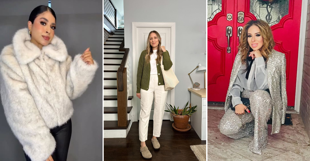
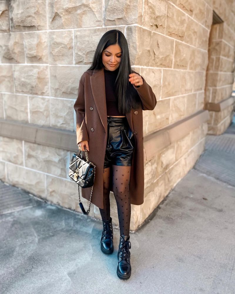
2. Beige + Black
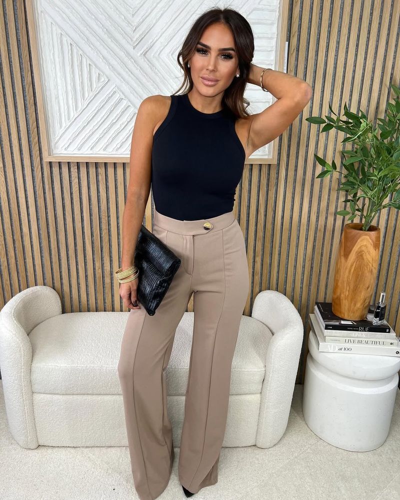
Who would have thought that beige, the humble underdog of colors, could shine so brightly next to black? This pairing takes you to a sophisticated realm where minimalism reigns. Envision a contemporary kitchen with sleek black cabinets, softly contrasted by beige walls.
The combination of beige and black exudes an air of quiet sophistication, making it a favorite among the fashion-forward crowd. It’s a marriage of subtlety and boldness, a dynamic duo that never goes out of style.
Use this pairing when you want to add a touch of elegance without the flair. With beige and black, less is truly more, proving that understated can be utterly captivating.
3. Olive + Cream
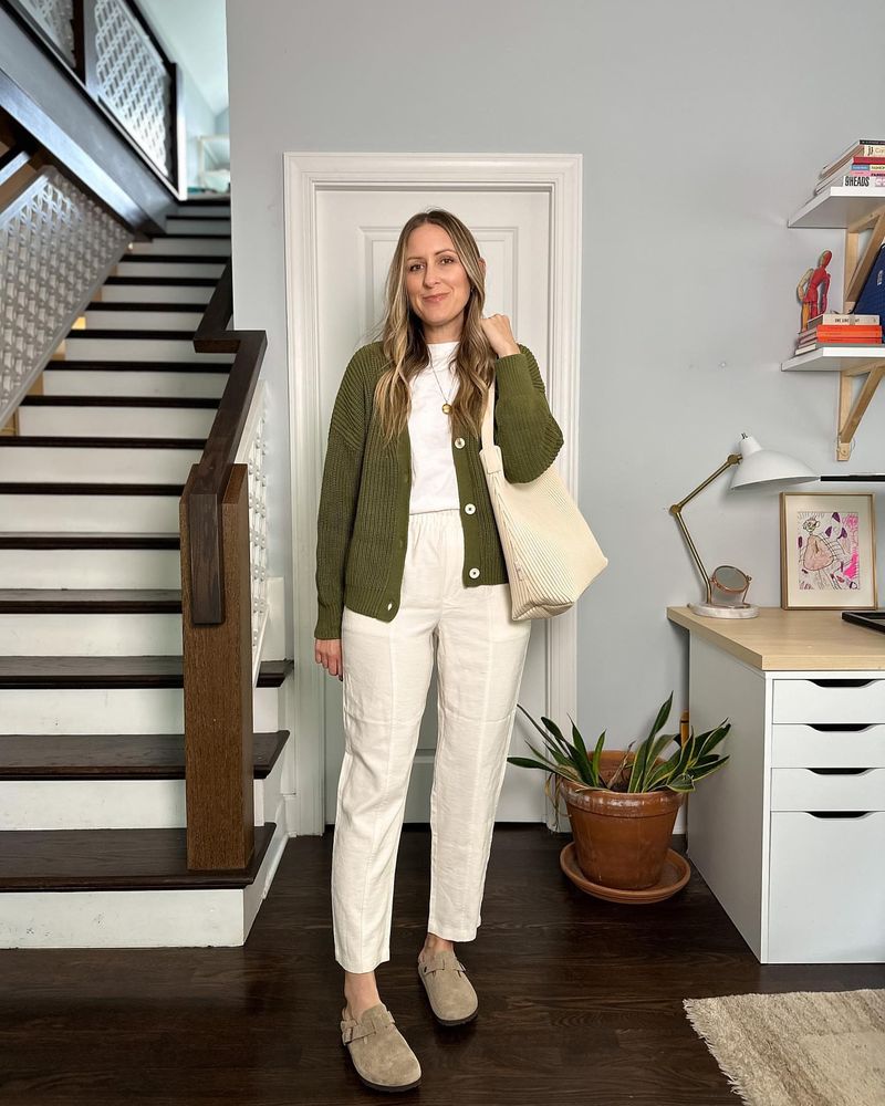
Step into the serene world of olive and cream, where nature meets modern living. This pairing evokes a sense of peacefulness, perfect for creating a warm, inviting space. Picture a rustic dining room with olive green walls and cream-colored furniture.
The colors blend harmoniously, inviting you to relax and enjoy the simpler things in life. Olive provides a touch of earthiness, while cream adds a light, airy feel to any space.
When you want to invite the warmth of the outdoors inside, look no further than olive and cream. It’s like bringing a piece of nature’s beauty right into your home, without the bugs. A pairing meant for those who appreciate subtle elegance.
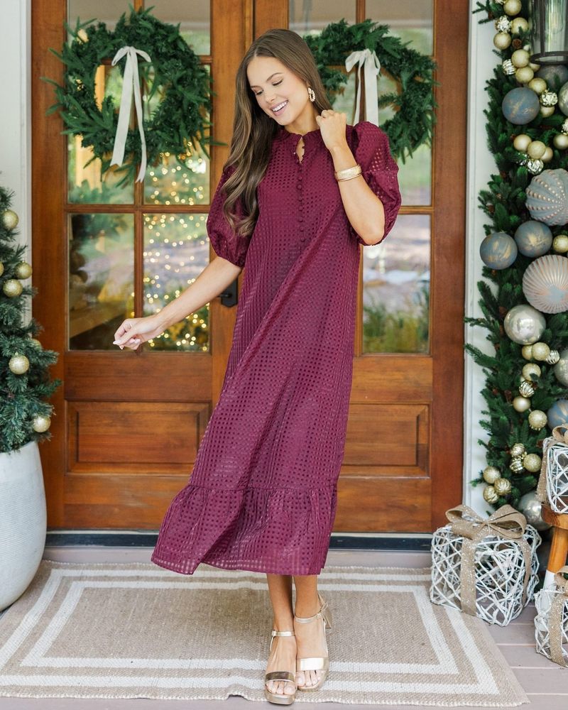
4. Burgundy + Blush
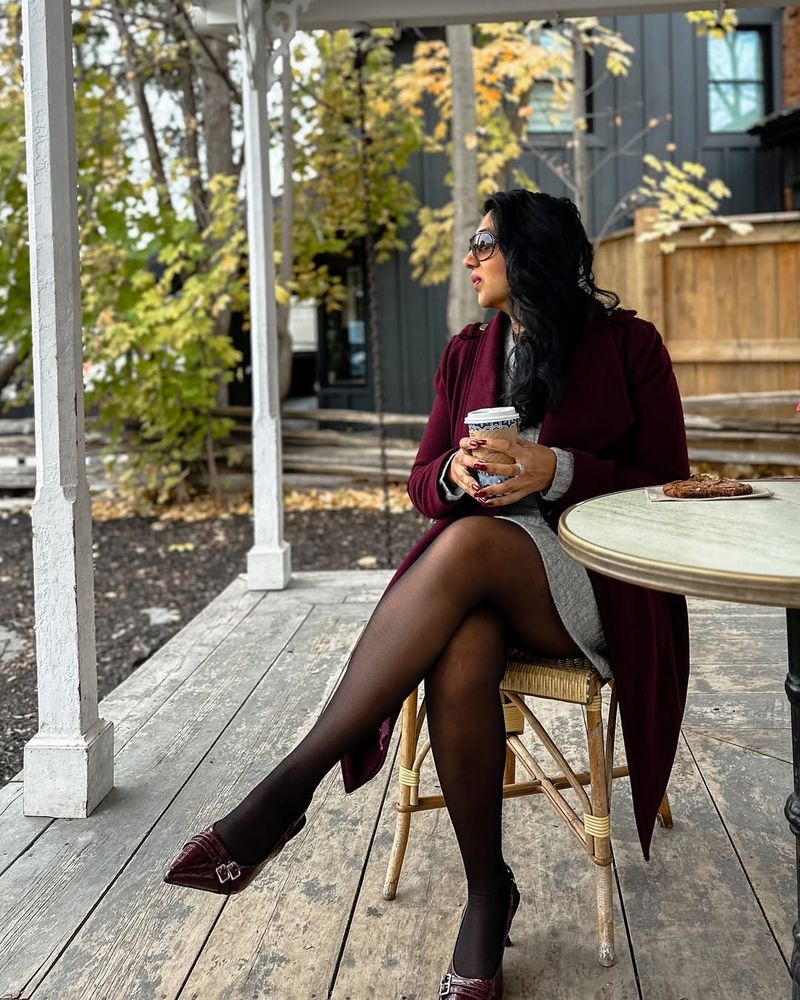
Romance is in the air with the lush pairing of burgundy and blush. Imagine a sophisticated wedding set-up with burgundy tablecloths and blush floral arrangements. This pairing speaks the language of love like no other.
Burgundy brings depth and richness, while blush adds a touch of softness, perfect for creating an intimate ambiance. Together, they weave a tapestry of elegance and charm that’s hard to resist.
Perfect for weddings, events, or just adding a touch of romance to your everyday life, burgundy and blush are the ideal companions. Like a fine wine and cheese, they complement each other in the most delightful way.
5. Gray + Camel
Welcome to the cityscape of color pairings, where gray and camel rule the streets. This duo exudes urban sophistication, effortlessly chic in any setting. Picture a camel trench coat draped over a gray sweater, with skyscrapers in the background.
The blending of gray’s neutrality with camel’s warmth creates a balanced, polished appearance. It’s the epitome of timeless elegance, never feeling out of place in the bustling city.
When you want to walk the line between modern and classic, gray and camel are your colors. They whisper luxury and style without ever shouting, making them a favorite among fashionistas everywhere.
6. Emerald + Gold
Step into a world of luxury with emerald and gold, a pairing that shouts opulence. Imagine an elegant home library with emerald green wall panels and gold-accented bookshelves. This combination is all about richness, both in color and style.
Emerald brings a touch of nature’s grandeur, while gold adds a sparkling elegance that’s impossible to ignore. Together, they create a lavish atmosphere, perfect for those who appreciate the finer things in life.
If you’re looking to make a statement, this is your go-to pairing.
7. Chocolate + Ivory

Indulge in the comfort of chocolate and ivory, a pairing that wraps you in warmth and tranquility. Visualize a cozy bedroom with chocolate-colored walls and ivory bedding. It’s like a warm hug on a cold day.
Chocolate offers richness and depth, while ivory lightens the mood with its soft elegance. This combination is perfect for creating a peaceful retreat, away from the hustle and bustle.
Ideal for bedrooms or lounges, chocolate and ivory invite relaxation and serenity. When you crave a cozy atmosphere, this pairing delivers, turning any space into a haven of comfort.
8. Denim Blue + Tan

Slide into effortless style with denim blue and tan, a pairing that epitomizes laid-back coolness. Picture denim blue jeans paired with a tan leather jacket, ready for a day in the great outdoors. This duo is all about comfort and simplicity.
Blue denim is versatile and timeless, while tan adds a touch of warmth, making it a perfect companion. Together, they create a look that’s both relaxed and fashionable, ideal for casual outings.
They’re like the best friends of the color world, always in sync.
9. Lilac + Charcoal
Enter the world of modern elegance with lilac and charcoal, where sophistication meets subtlety. This pairing is all about balance, bringing a contemporary yet soothing vibe to any space.
Lilac offers a touch of color, while charcoal grounds the look with its deep, neutral tone. Together, they create a harmonious environment that’s both stylish and calming.
Perfect for those who love modern aesthetics, lilac and charcoal offer a unique twist to everyday design. When you want to stand out without being loud, this is your go-to pairing.
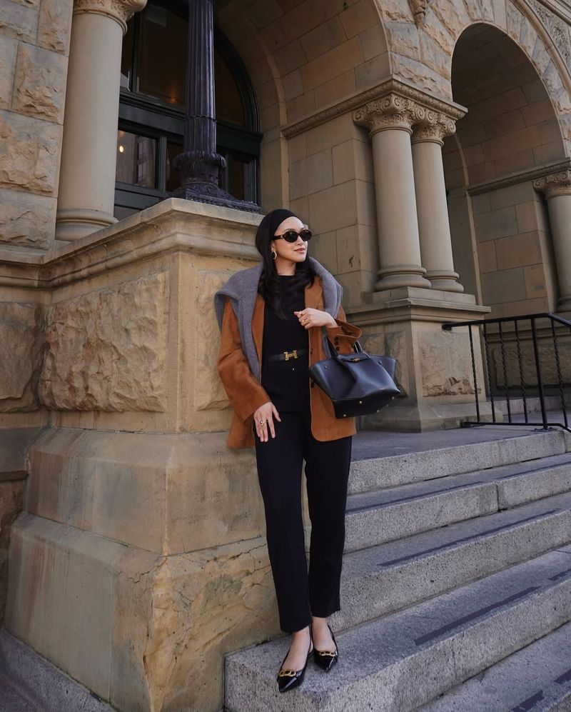
10. Rust + Navy
Dive into the rustic charm of rust and navy, a pairing that’s bold and inviting. Imagine a rustic-themed kitchen with navy cabinetry and rust-colored accents. This combination brings a sense of coziness and warmth to any environment.
Rust adds a touch of earthiness, while navy provides depth and stability, creating a perfect balance. Together, they form a look that’s both welcoming and stylish, ideal for those who love a homey feel.
Use rust and navy when you want to add character to your space. It’s a pairing that tells a story, bringing warmth and depth wherever it goes.
11. Forest Green + Mustard
Embrace the colors of the forest floor with forest green and mustard, a pairing that celebrates nature’s palette. Picture an autumn park scene with forest green trees and mustard-colored fallen leaves. This combination embodies the beauty of the great outdoors.
Forest green offers a rich, natural tone, while mustard adds a touch of brightness, creating a perfect harmony. Together, they bring a sense of adventure and exploration to any space.
Ideal for those who love nature-inspired designs, forest green and mustard are your ticket to an earthy, vibrant world. Step into the wild with this duo and discover the magic of nature.
12. Soft Pink + Brown

Step into a whimsical world with soft pink and brown, a pairing that brings a sense of playfulness and warmth. Imagine a children’s room with soft pink walls and brown wooden furniture. It’s a color combination that’s both cozy and inviting.
Soft pink offers a gentle touch, while brown provides a grounding element, making it perfect for nurturing environments. Together, they create a balanced, soothing atmosphere that encourages creativity and relaxation.
Ideal for bedrooms or play areas, soft pink and brown are the perfect companions for a charming, delightful space. When you want to create a haven of comfort, this duo delivers.
13. Red + Neon Green
Welcome to the clash of colors with red and neon green, a pairing that’s anything but subtle. This duo is a chaotic burst of color, often leading to visual overload.
Red offers intensity, while neon green adds a glaring brightness, making it a challenging pair to pull off. Together, they create a jarring clash that’s hard to miss.
Use this pairing when you want to stand out, but be warned: it’s not for the faint of heart. Red and neon green are the rebels of the color world, defying conventional harmony.
14. Purple + Orange
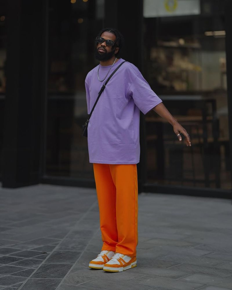
Step into the world of mismatched madness with purple and orange, a pairing that dares to defy harmony. Imagine a room filled with purple and orange decor, clashing in a cacophony of color. This duo is all about boldness, but not in the most flattering way.
Purple brings a royal tone, while orange offers lively energy, yet together they often result in visual chaos. It’s a combination that’s hard to balance, often leaving a disjointed impression.
If you’re feeling adventurous, give purple and orange a try, but proceed with caution. This pairing is notorious for its clashing tendencies, making it a daring choice.
15. Lime + Fuchsia
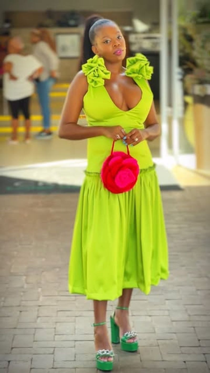
Enter the world of vibrant discord with lime and fuchsia, a pairing that’s as bold as it is jarring. Picture a garden party with lime and fuchsia decorations, clashing against a vibrant green lawn. This combination is a feast for the eyes, but not always in the best way.
Lime offers a zesty freshness, while fuchsia brings a splash of bold color, creating a striking contrast. Together, they often result in visual overload, making it a challenging combination to master.
If you’re looking to make a statement, lime and fuchsia will definitely do the trick, but be prepared for a clash of titans. It’s a daring duo that’s not for the faint-hearted.
16. Black + Brown
Meet the clash of basics with black and brown, a pairing that often results in a fashion faux pas. Envision an outfit with mismatched black and brown clothing clashing in a dull display of color. This duo is a tricky combination, often leading to an underwhelming result.
Black offers a classic base, while brown brings warmth, yet together, they can appear disjointed and uninspired. It’s a pairing that lacks the harmony needed for a cohesive look.
If you’re striving for a polished appearance, it’s best to keep black and brown separate. This combination often falls flat, making it a less desirable choice in the world of fashion.
17. Cobalt + Bright Yellow
Dive into the world of vibrant chaos with cobalt and bright yellow, a pairing that’s as intense as it is clashing. Imagine a room with cobalt walls and bright yellow accents, bursting in a vivid explosion of color. This combination is not for the faint-hearted.
Cobalt offers a rich, deep tone, while bright yellow adds a glaring brightness, creating a visual overload. Together, they form a pairing that’s challenging to balance, often resulting in a chaotic appearance.
If you’re seeking to make a bold statement, cobalt and bright yellow are the way to go, but be prepared for their clashing tendencies. It’s a daring choice that requires a careful touch.
18. Silver + Gold (in wrong textures)
Enter the metallic discord of silver and gold, a pairing that can clash when textures go wrong. Picture a room filled with silver and gold decor, differing in texture and sheen, creating a mismatched metallic mess. This combination is all about balance, or lack thereof.
Silver offers a sleek, modern vibe, while gold brings warmth and luxury, yet together they can appear disjointed when textures don’t align. It’s a pairing that thrives on harmony but can easily fall into chaos.
If you’re working with metallics, pay attention to texture. Silver and gold can shine together, but only when textures are carefully considered, making it a challenging duo to master.
19. Hot Pink + Bright Blue
Welcome to the world of clashing contrasts with hot pink and bright blue, a pairing that’s anything but subtle. Picture a teenage room with hot pink and bright blue decor, clashing in a colorful explosion. This duo is all about making a statement, but not always in the best way.
Hot pink offers a bold, energetic vibe, while bright blue adds intensity, creating a striking contrast. Together, they often result in visual chaos, making it a challenging combination to balance.
If you’re feeling adventurous, hot pink and bright blue are sure to stand out, but be prepared for their clashing nature. It’s a daring choice that requires a careful touch.
20. Mint + Burgundy
Step into the world of unusual pairings with mint and burgundy, a combination that often results in visual discord. Imagine a living room with mint green walls and burgundy furniture, clashing in an awkward mix. This duo is all about contrast, but not in the most harmonious way.
Mint offers a refreshing coolness, while burgundy brings depth and richness, yet together they can appear mismatched and disjointed. It’s a pairing that’s hard to balance, often leaving a disjointed impression.
If you’re looking to experiment with color, mint and burgundy are sure to provide an interesting challenge. Just be prepared for their clashing tendencies, making it a daring choice for the adventurous.
21. Mustard + Lavender
Enter the realm of discord with mustard and lavender, a pairing that dares to defy color harmony. Picture a bedroom with mismatched mustard and lavender decor, clashing in a dissonant array of color. This duo is all about boldness, but not in the most flattering way.
Mustard brings a warm, earthy tone, while lavender adds a soft, floral touch, yet together they often result in a chaotic appearance. It’s a combination that’s hard to balance, often leaving a disjointed impression.
If you’re feeling adventurous, give mustard and lavender a try, but proceed with caution. This pairing is notorious for its clashing tendencies, making it a daring choice.
22. Coral + Red
Step into the lively clash of coral and red, a pairing that’s as bold as it is dissonant. Imagine a garden with coral flowers and red accents, bursting in a vibrant display of color. This combination is all about energy, but not always in the most harmonious way.
Coral offers a fresh, lively hue, while red adds intensity, creating a striking contrast. Together, they often result in visual discord, making it a challenging combination to balance.
If you’re looking to make a bold statement, coral and red are sure to stand out, but be prepared for their clashing nature. It’s a daring choice that requires a careful touch.
23. Navy + Black (when mismatched)
Meet the clash of classics with navy and black, a pairing that can go wrong when mismatched. Envision an outfit with mismatched navy and black clothing, resulting in a dull, disjointed appearance. This duo is a tricky combination, often leading to an underwhelming result.
Navy offers a rich, deep tone, while black provides a classic base, yet together they can appear disjointed and uninspired when not properly matched. It’s a pairing that requires careful coordination to succeed.
If you’re striving for a polished appearance, take care when combining navy and black. This combination can shine, but only with careful attention to detail, making it a challenging duo.
24. Teal + Maroon

Enter the world of clashing contrasts with teal and maroon, a pairing that’s anything but harmonious. Picture a living room with teal walls and maroon furniture, clashing in an awkward display of color. This duo is all about contrast, but not in the most flattering way.
Teal offers a cool, calming tone, while maroon brings depth and warmth, yet together they can appear mismatched and disjointed. It’s a pairing that requires careful balance to succeed.
If you’re feeling adventurous, teal and maroon are sure to provide an interesting challenge. Just be prepared for their clashing tendencies, making it a daring choice for the bold.