
20 Colors That Will Rule The Spring-Summer Season
I’ve been watching the runways and poring over fashion forecasts for months now, and I’m excited to share what I’ve discovered.
Color trends this spring and summer are taking unexpected turns, with both bold statements and subtle classics making their mark.
My predictions come from analyzing designer collections, street style, and what’s starting to appear in stores – so get ready to refresh your wardrobe with these game-changing hues!
1. Butter Yellow
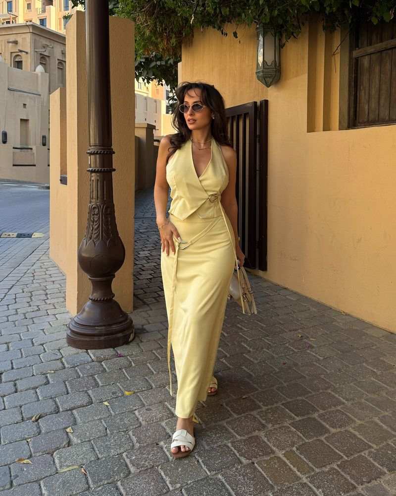
Remember that feeling of warm sunshine after a long winter? That’s butter yellow in color form. I spotted this shade dominating Milan Fashion Week, where designers paired it with crisp whites and navy blues for a refreshing take on spring classics.
What makes this yellow special is its softness – not screaming for attention but still brightening every outfit it touches. It works beautifully on everything from flowing sundresses to structured blazers.
If you’re hesitant about yellow, this is your gateway shade. It flatters most skin tones and pairs easily with neutrals you already own. I’ve already bought a butter yellow cardigan that’s become my go-to layering piece for unpredictable spring temperatures.
2. Pistachio Green
Fashion houses can’t get enough of pistachio green right now. Walking through department stores last week, I noticed this soft, natural shade appearing on everything from handbags to sundresses.
The beauty of pistachio lies in its versatility. Unlike some greens that scream “look at me,” this shade carries a quiet confidence. It pairs wonderfully with cream, beige, and even darker greens for a tonal look that feels so current.
My favorite way to wear it? A pistachio linen shirt with white jeans creates an effortless summer look. For those wanting just a taste, try accessories first – a pistachio belt or headband adds freshness to neutral outfits without overwhelming them.
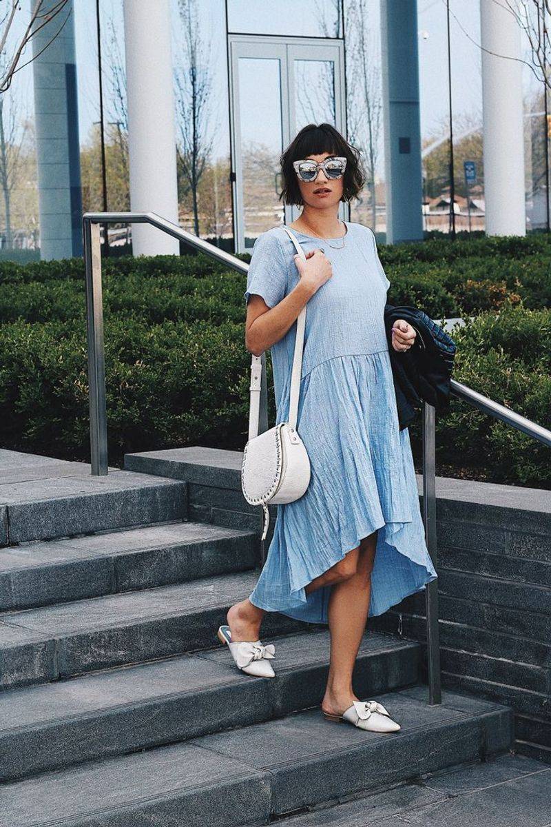
3. Sky Blue
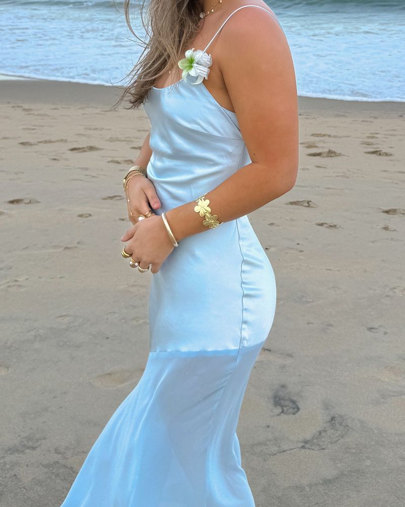
Nothing says “carefree summer days” quite like sky blue. I’ve tracked this color’s rise from coastal vacation wear to mainstream fashion must-have. The shade captures that perfect clear summer sky – not too intense, not too pale.
Sky blue creates an instant mood lift in any outfit. I’ve noticed designers using it in unexpected ways – not just in predictable nautical stripes but in sleek monochromatic looks and even formal evening wear.
What surprised me most at recent fashion shows was seeing sky blue paired with rust orange and terracotta – a combination that shouldn’t work but somehow creates magic. For everyday wear, try sky blue with denim for an easy tonal look, or make it pop against crisp white for classic summer style.
4. Lavender
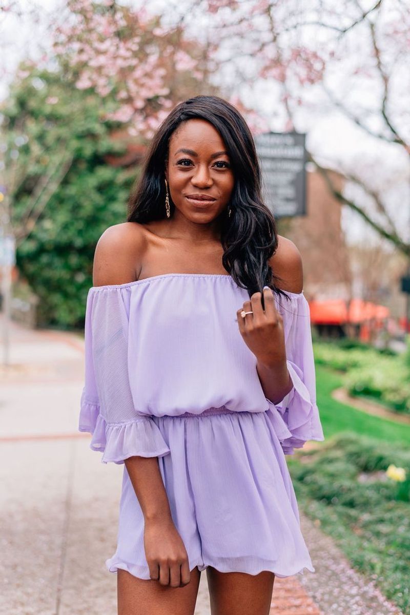
Lavender has shaken off its grandmotherly associations to become spring’s most romantic shade. After seeing it in three consecutive runway shows, I knew this wasn’t just a passing fancy but a full-fledged trend with staying power.
The current iteration of lavender feels fresh and modern – slightly desaturated compared to previous seasons. It’s appearing in unexpected places too – menswear collections are embracing this traditionally feminine hue in shirts, accessories, and even suits.
My style tip? Lavender looks stunning with gray for a sophisticated pairing, or with cream for something softer. I recently picked up lavender linen pants that work for both office days and weekend brunches – proving this color’s remarkable adaptability across settings.
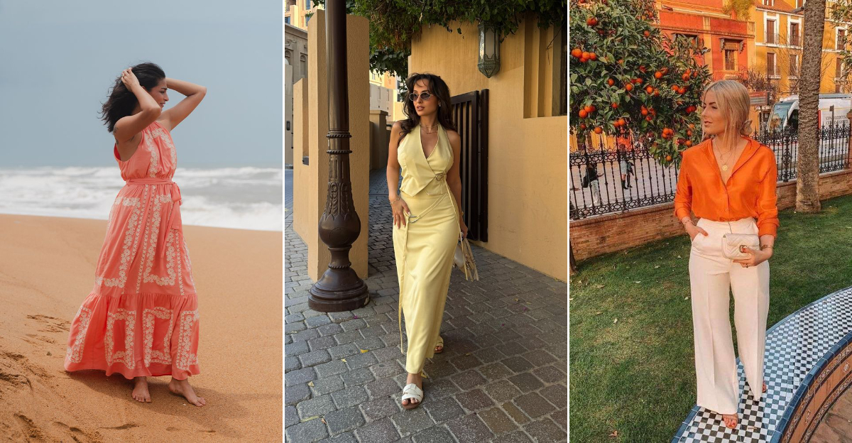
5. Soft Coral
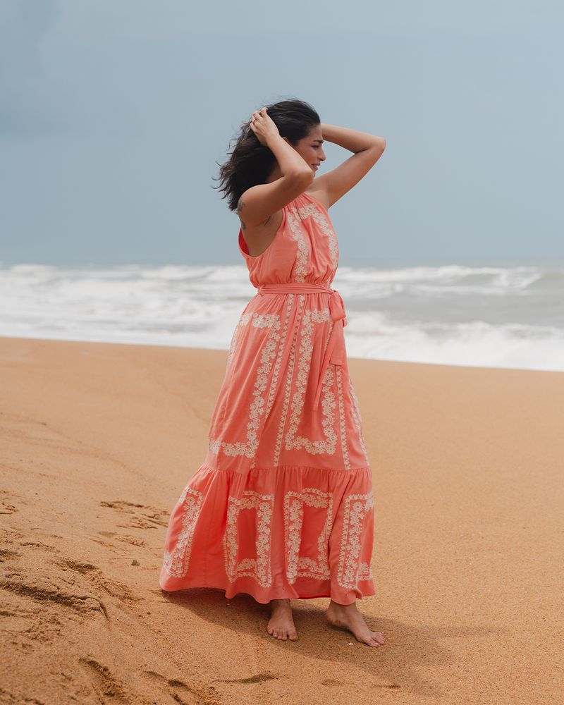
Soft coral brings warmth without the intensity of its brighter cousins. I first noticed this shade taking over my Instagram feed in early spring, and now it’s everywhere I look – from luxury boutiques to fast fashion windows.
This color carries the energy of summer sunsets and tropical getaways. What makes it so wearable is its flattering effect – it adds a healthy glow to almost every skin tone, making it one of the most inclusive trend colors this season.
My personal favorite pairing is soft coral with chocolate brown – an unexpected combination that feels fresh and sophisticated. For those new to this shade, try a coral accessory like a scarf or handbag before committing to larger pieces.
6. Vibrant Orange
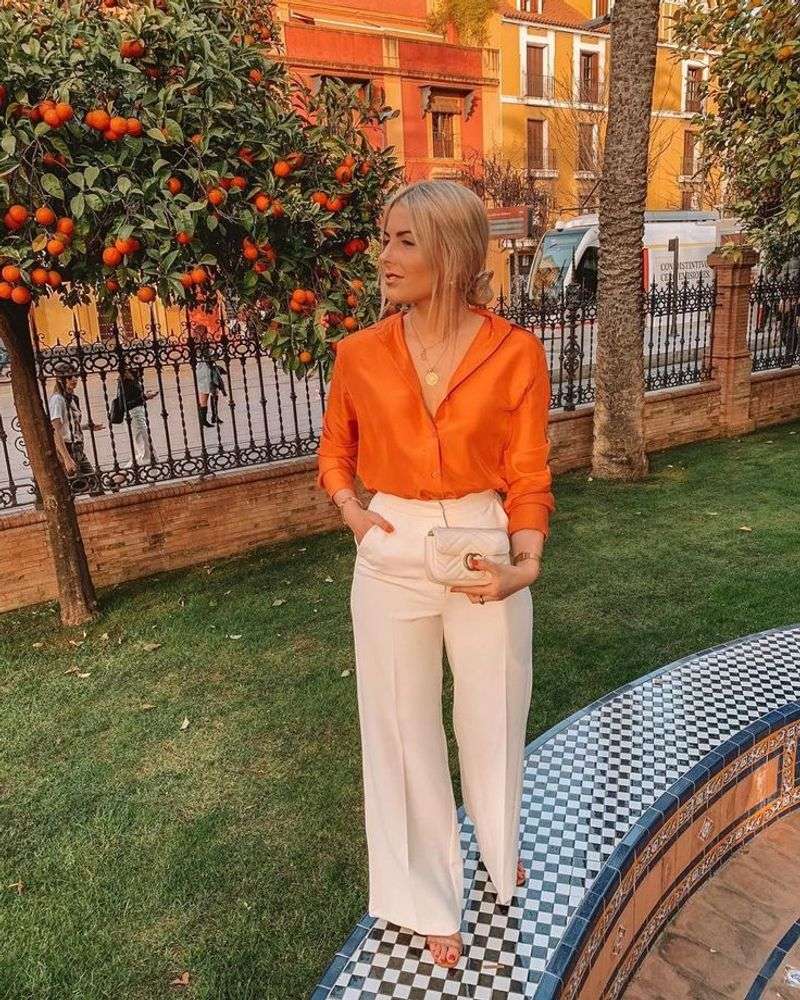
Fashion is embracing joy this season, and nothing says optimism like vibrant orange. This isn’t a shy, background color – it demands attention and makes a statement. I watched this shade steal the show at several designer presentations where it appeared in head-to-toe looks.
The trick to wearing such a bold hue is balance. When I tried an orange blazer recently, I kept everything else neutral – white shirt, simple jeans – letting the color be the star. The effect was powerful yet wearable.
For those not ready to go all-in, orange accessories pack a punch against navy or beige outfits. What makes this trend especially interesting is how designers are using texture to temper the boldness – think orange in soft linens, crinkled cottons, and sheer fabrics.
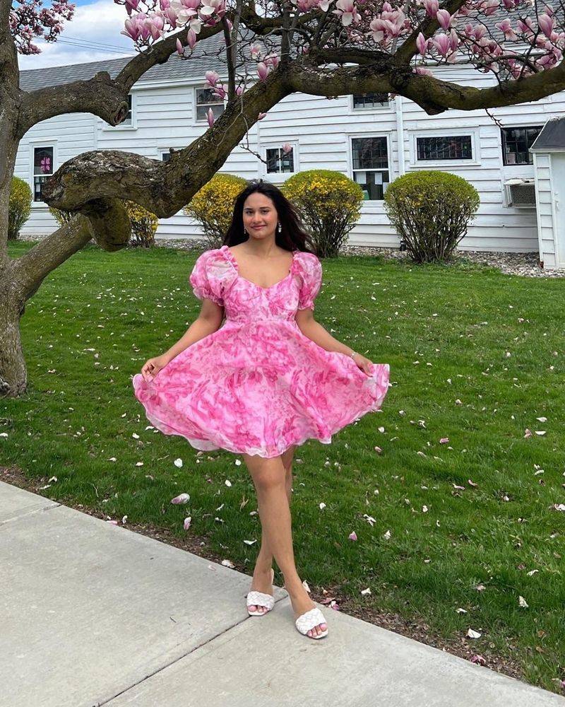
7. Bubblegum Pink
Bubblegum pink has evolved from Barbie-inspired novelty to legitimate fashion statement. I was skeptical until I saw how designers are reimagining it with modern silhouettes and unexpected pairings that remove any childish associations.
The current take on bubblegum pink feels deliberate and confident. At recent fashion events, I noticed it paired with burgundy, forest green, and even black – combinations that give this playful color serious fashion credibility.
My approach to wearing this shade? Start small with accessories if you’re hesitant. For the bold, try a bubblegum pink oversized sweater with tailored pants for a look that balances fun and sophistication. The joy of this color is its ability to instantly lift your mood – something we could all use more of.
8. Cobalt Blue
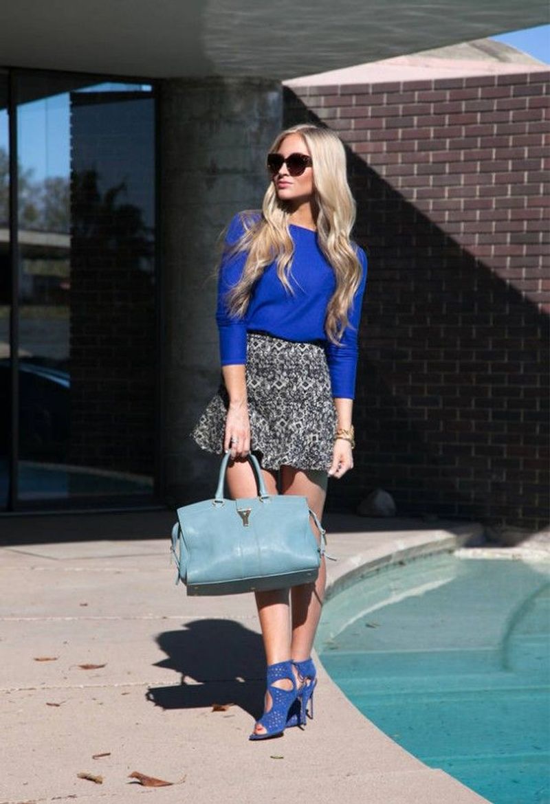
Cobalt blue brings electric energy to the season’s palette. I fell for this shade after seeing it dominate street style photos from Paris to Tokyo – it’s truly a global phenomenon this year.
Unlike navy or powder blue, cobalt demands attention without trying too hard. The intensity of this color means a little goes a long way. My favorite styling approach is using it as a statement piece – a cobalt handbag or shoes against neutral clothing creates instant visual interest.
For evening events, cobalt is unbeatable – I recently wore a simple cobalt slip dress to a gallery opening and received compliments all night. The color photographs beautifully and looks expensive even in more affordable fabrics, making it perfect for special occasions and social media moments alike.
9. Mint Green
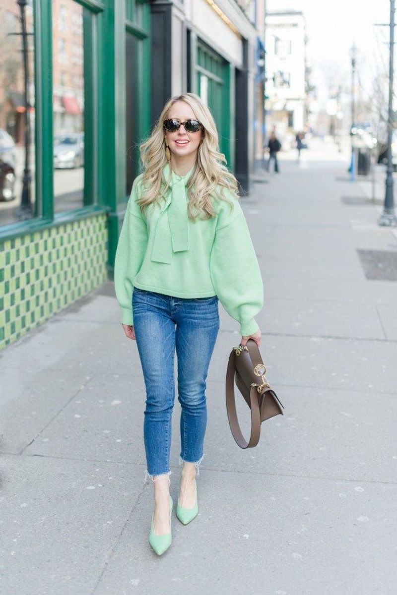
Mint green has emerged as the refreshing palate cleanser among this season’s bolder hues. I first noticed it gaining traction in home décor before it made the jump to fashion – a common pattern for color trends.
The current iteration of mint feels sophisticated rather than saccharine. Designers are using it for structured pieces like tailored trousers and crisp button-downs, moving away from expected flowy silhouettes. This gives the color a modern, almost architectural quality.
My personal style hack: mint green pairs beautifully with warm neutrals like camel and tan, creating a balance that feels both grounded and fresh. For work, I’ve been wearing a mint blouse with camel trousers – a combination that feels professional yet distinctive in a sea of black and navy office wear.
10. Sand Beige
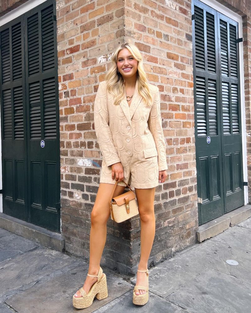
Sand beige has shed its reputation as boring and emerged as spring’s most sophisticated neutral. Walking through luxury boutiques last month, I noticed entire collections built around this seemingly simple shade.
The magic happens when sand beige is used in different textures within the same outfit. Think silk shirts with linen pants, or suede accessories with cotton dresses. These combinations create subtle depth that feels incredibly luxurious.
My favorite way to wear it is in a tonal look – varying shades of beige from head to toe. The effect is understated yet impactful. For those who find beige challenging, look for warmer versions with yellow undertones if you have warm skin, or cooler versions with pink undertones if your skin is cool.
11. Lilac
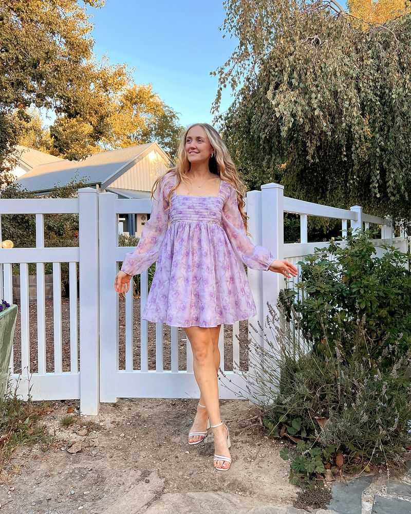
Lilac has matured from sweet spring flower to sophisticated fashion staple. I watched with interest as this color transitioned from accent to main character in collections from New York to London.
The current incarnation of lilac has depth and complexity – slightly grayed out compared to previous seasons, making it easier to wear and combine. Men’s fashion has particularly embraced this shade, pairing it with charcoals and navies for looks that challenge traditional color boundaries.
My approach to wearing lilac focuses on contrasts – the softness of the color pairs beautifully with leather or denim for an unexpected edge. For special occasions, lilac in silk or satin creates a memorable alternative to expected evening colors. The versatility of this shade continues to surprise me with each new styling experiment.
12. Terracotta
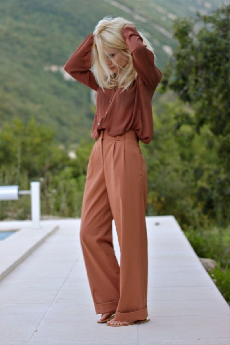
Terracotta brings earthy warmth to spring’s typically pastel palette. After spotting this rich, clay-inspired shade repeatedly during my research for this article, I’m convinced it’s the sleeper hit of the season.
The appeal of terracotta lies in its natural origins – it connects us to earth and sun, perfect for the season of renewal. Designers are using it for everything from swimwear to evening dresses, proving its remarkable versatility.
My styling advice? Terracotta pairs naturally with neutrals but creates magic when combined with turquoise or teal – a combination that recalls Mediterranean tile work. For everyday wear, I’ve been loving terracotta linen shirts with white bottoms – an effortless combination that works from spring through late summer.
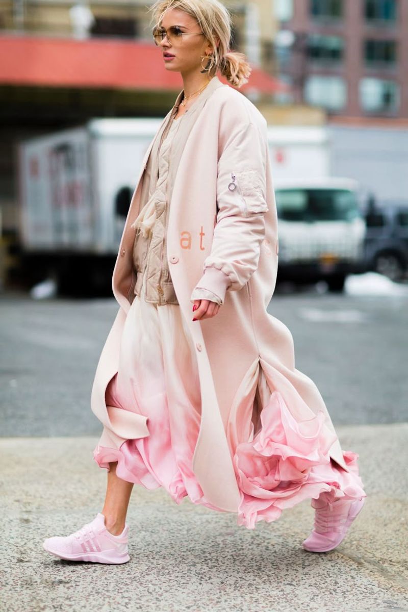
13. Blush Rose
Blush rose continues its reign as fashion’s favorite not-quite-neutral. I’ve tracked this color through multiple seasons now, watching it evolve from trendy to timeless – the mark of a truly successful shade.
What makes blush rose special is its chameleon quality. In some lights it reads almost neutral, in others it’s distinctly pink. This versatility makes it incredibly wearable across settings and seasons.
My clients consistently report that blush rose garments become the most-worn items in their wardrobes. The color works beautifully with denim, khaki, navy, and gray – practically everything! For special events, blush rose in luxurious fabrics like silk or velvet creates a sophisticated alternative to black that photographs beautifully.
14. Ocean Teal
Ocean teal captures that perfect blue-green of tropical waters. During my color trend research, I found this shade consistently appearing in both high fashion and mainstream collections – a sign of its universal appeal.
The beauty of ocean teal is its depth and complexity. Sometimes it leans more blue, sometimes more green, creating visual interest that flat colors lack. This dimension makes it exceptionally flattering as it picks up undertones in different skin tones.
My favorite pairings include ocean teal with chocolate brown for an unexpected sophistication, or with crisp white for classic summer freshness. For those new to this color, try it in a patterned piece where it’s mixed with other shades – this can be an easier introduction than a solid block of color.
15. Lime Green
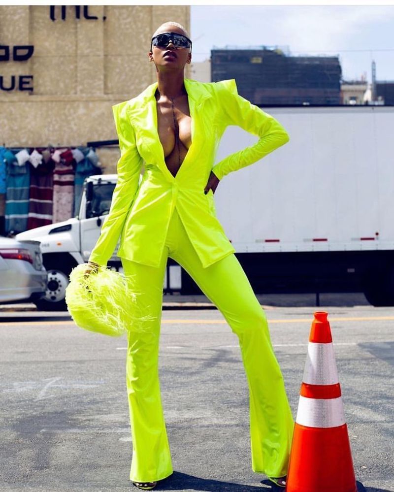
Lime green has made the leap from accent color to main event. I’ve watched this zesty shade climb from the fringes of fashion to center stage, appearing in collections from designers not typically known for bold color choices.
The current approach to lime green involves tempering its intensity – pairing it with neutrals or using it in smaller doses for maximum impact. Fashion-forward individuals are wearing it head-to-toe, but most of us will prefer it as a statement piece within an otherwise subdued outfit.
My personal styling rule: lime green needs space to breathe. When I wear it, I keep accessories minimal and let the color do the talking. This approach prevents the shade from feeling overwhelming while still capturing its energetic essence. The confidence boost from wearing such a bold color is remarkable – something we could all use this season.
16. Creamy Ivory
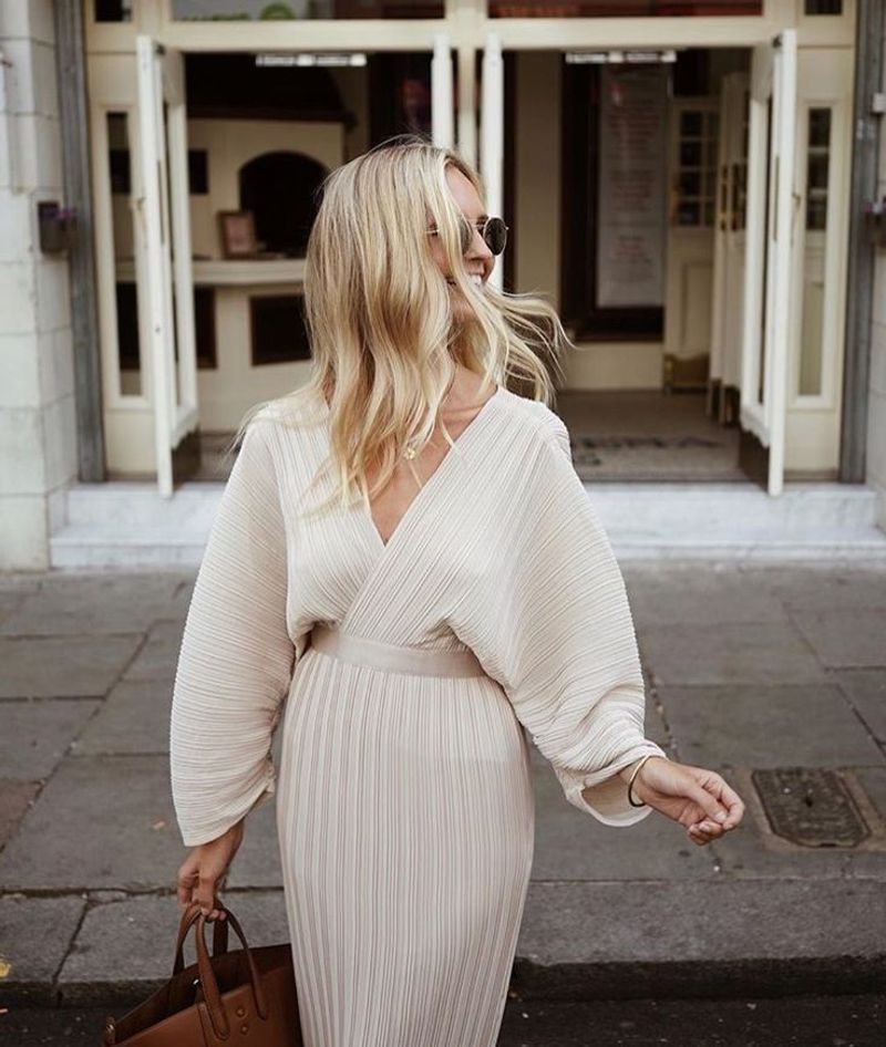
Creamy ivory has replaced stark white as this season’s clean canvas color. After years of bright whites dominating spring fashion, this softer alternative feels like a breath of fresh air – less harsh while maintaining that crisp, clean feeling we crave in warmer months.
The subtle warmth of ivory makes it more flattering than pure white for most skin tones. I’ve noticed designers using it for structured pieces like tailored suits and crisp shirts, where the softness of the color balances the rigidity of the silhouette.
My tip for keeping ivory looking luxurious rather than dingy? Fabric choice matters enormously. Look for natural fibers like cotton, linen, and silk, which showcase the depth and warmth of ivory beautifully. For care, don’t mix with brighter whites when washing – ivory should maintain its creamy quality.
17. Tangerine
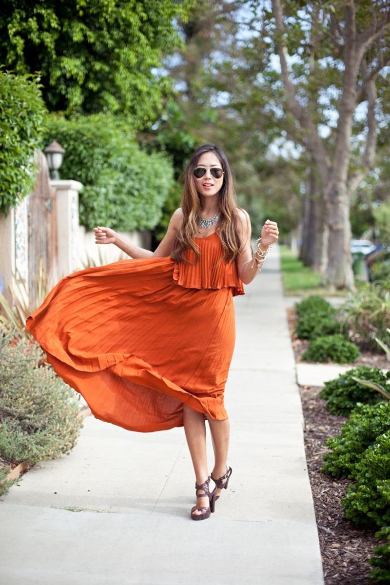
Tangerine brings juicy energy to fashion this season. I first spotted this vibrant orange-red hybrid at resort collections, where it captured the essence of tropical sunsets and citrus groves.
Unlike softer oranges, tangerine makes no apologies for its boldness. It’s appearing in unexpected categories – formalwear, accessories, and even athletic gear. The most fashion-forward approach pairs tangerine with equally bold colors like fuchsia or cobalt for maximum impact.
My advice for tangerine newcomers: start with accessories or a single statement piece like a handbag or shoes. The color looks particularly stunning against navy or denim, creating contrast that makes both colors pop. For evening events, tangerine in silk or satin creates a memorable alternative to expected black or red.
18. Periwinkle
Periwinkle bridges the gap between blue and purple with dreamy elegance. Having tracked color trends for years, I’m not surprised to see this shade making a comeback – it perfectly balances current desires for both serenity and uniqueness.
Fashion houses are using periwinkle in unexpected ways – not just for romantic dresses but also structured suits and even leather goods. The color has a nostalgic quality while still feeling fresh and modern.
My favorite styling approach pairs periwinkle with warm neutrals like camel or cognac leather for a sophisticated contrast. For casual looks, periwinkle and denim create an easy tonal combination that feels pulled together without trying too hard. The versatility of this shade continues to impress me – it works across seasons and occasions with remarkable adaptability.
19. Light Denim Blue
Light denim blue has transcended its casual roots to become a fashion color in its own right. I’ve been fascinated watching this transformation – what was once limited to jeans is now appearing in everything from evening gowns to tailored suits.
The appeal lies in light denim blue’s familiarity – we all have positive associations with this color from our favorite worn-in jeans. When translated to other fabrics and contexts, it brings that same comfort while feeling unexpectedly fresh.
My styling recommendation? Try light denim blue in unexpected textures like silk, linen, or even leather. These material contrasts create interesting tension between casual color and formal fabric. For a modern look, I love light denim blue paired with crisp white or soft cream – a combination that feels simultaneously classic and current.
20. Pearl White
Pearl white brings luminous elegance to spring and summer wardrobes. After seasons dominated by either stark whites or creams, this in-between shade with its subtle iridescence feels genuinely innovative.
The distinguishing feature of pearl white is its dimension – unlike flat white, it catches light in a way that creates subtle highlights and shadows. This quality makes it exceptionally flattering and photogenic. Designers are using it for statement pieces like structured dresses and tailored suits.
My approach to pearl white focuses on texture – the color looks most luxurious in fabrics with natural sheen like silk charmeuse or fine wool blends. For casual wear, look for cotton with subtle luster or linen blends that capture the pearlescent quality. This shade pairs beautifully with soft metallics like rose gold for a refined, elegant look.